Artist Hwang In-heh at her studio in Seocho-dong.
On a midsummer day in July 2024, visiting the studio of artist Hwang In-heh in Seocho-dong, Seoul was an inspiring journey to experience the fusion of traditional Korean beauty and contemporary abstract art. Having maintained a long-standing relationship with artist Hwang In-heh and having appreciated her works over time, I had the opportunity to delve deeper into her artistic world and philosophy through an in-depth interview that day. I would like to share the key points of this interview with the readers.
Beginnings and Growth
Hwang In-heh began her artistic activities in late 1969. Initially, she aimed to study art history but had to give up the opportunity to study abroad due to family responsibilities and her parents’ illnesses. This choice became a pivotal moment that changed her artistic path.
In My Childhood, Ink and Color on Hanji, 170×106cm, 1998
Birth of Hangeul Abstraction
In the 1990s, Hwang started working on abstract art using Hangeul. Her goal was to elevate the scientific and simplistic elegance of Hangeul, created by King Sejong, into an artistic form. By transforming the dots, lines, and planes (i.e, ㆁ-circle, ㅿ-triangle, ㅁ-square) of Hangeul, she aimed to highlight its beauty and excellence.
Ganadara, Traditional Korean paper on canvas, ink & mixed media, 72.7×60.6cm, 2023
Hwang explained, “Being able to use all elements of Hangeul in my work is a gift from King Sejong.” She emphasized that her work transcends art and holds cultural significance.
Knotwork
In addition to Hangeul abstraction, Hwang is renowned for her work with knots made from twisted hanji (Korean paper). These knots hold significant symbolic meaning, representing her relationship with her mother. Through the knotting techniques learned from her mother, Hwang expresses the love and connections of her family.
Ganadara, Charcoal and Ink Color on Hanji with Knot Button, 56×55cm, 2002
Exhibitions and International Recognition
Hwang In-heh began showcasing Hangeul abstraction to the world, starting with the 1994 Budapest Art Expo. Her solo exhibition at the Korean Cultural Center in Paris in 1995 marked a significant turning point. French audiences highly praised the artistic value of Hangeul, showing great enthusiasm.
Eiffel Tower Outside the Window, Ink on Hanji, 22×25cm, 1995
To deepen the understanding of Hwang In-heh's artistic world, we would like to introduce the following critique by esteemed art critic Seo Guil-heon.
The Boundless Love and Unity of the Universe
- The World of Paintings by Hwang In-heh
Seo Guil-heon (Art Critic, Ph.D. in Fine Arts)
Influenced by her father, who excelled in poetry, calligraphy, and painting from an early age, artist Hwang In-heh naturally gravitated towards brush and ink, mastering calligraphy and painting. Through this process, she grasped the formative order of nature and the universe, cultivating a world of paintings that embody the harmonious unity of love.
Ilwol Sagye-do which represents Sun, Moon and the four Seasons, 193 x 480cm
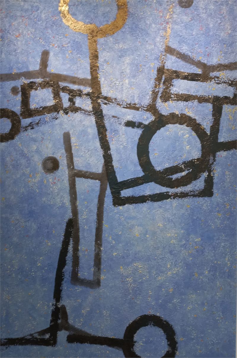
Her recent work, "Ilwol Sagye-do (Sun, Moon, Four Seasons Painting)," integrates all the elements she has employed in her art over the years, encompassing the harmonious world of nature and the universe that consistently conveys the boundless world of love. This love is depicted through the convergence of cosmic elements represented by images of red, green, white, and blue areas resembling mountain peaks. Each panel representing the four seasons—autumn, spring, winter, and summer—features patterns from traditional Korean court attire, woven motifs, lotus patterns symbolizing birth, and images of auspicious animals like dragons and phoenixes. These elements collectively reflect traditional Korean views of nature and cosmic order. The panels are interconnected by the message of 'love,' composed of symbolic elements that deconstruct Hangul into consonants and vowels, establishing a close relationship akin to strokes in calligraphy. For instance, the 'ㅇ' at the bottom left symbolizes the sun, the tailed 'ㅇ' on the right symbolizes the moon, and the inverted 'ㄹ' in the middle represents a goose, a symbol of love. These elements unify the panels, divided by seasonal colors, into a fundamental whole, representing boundless love.
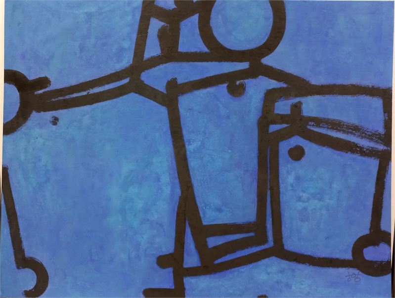
Ganadara, Traditional Korean paper on canvas, ink & mixed media, 91x116.8cm 2021
The theme of boundless love is a spiritual legacy inherited from her mother. This is first introduced in her paintings as the specific formative element of a knotted button. These buttons, made by twisting traditional Korean paper, were taught to her by her mother during her art school days and traditionally served as fasteners for hanbok (Korean traditional clothing). These buttons, as small points and three-dimensional objects, contrast with the flat plane of the painting, symbolizing humanity's role in grounding abstracted flat surfaces. Humans, standing on the earth, aim towards the sky. Hwang's abstract representation of Hangul, formed from the principles of heaven, earth, and humanity, naturally embodies these fundamental cosmic elements.
The endless love 0539 soonji, ink, charcoal, colors 32x24cm 2005
In her works, the flat plane of the canvas and the three-dimensional object of the knot merge, with the plane often reflecting the earth or the sky. This plane, beyond mere physical flatness, encapsulates the Oriental view of the universe. Traditional Korean paper, known for its absorbency, not only absorbs ink but also retains external forces like moisture, heat, and noise, preserving their silent value within the painting. Utilizing such materials with life-sustaining characteristics, the artist internalizes and imbues her works with the precious spiritual values of her lived experience. Her bold compositions through color field division create spaces that interlock to form a unified base, with knotted buttons expanding the visual space, making the canvas feel like an expansive sky of cosmic space.
Ganadara, Traditional Korean paper on canvas, mixed media 193.9x130.3cm 2021
The sky, positioned above the earth and connected by humans, mirrors on the canvas, reflecting the spread of the earth like a vessel containing the expanse of the sky, akin to the sky and clouds reflected in a pond. "Ilwol Sagye-do," divided into four parts representing the seasons, sets the entire scene into a grand composition with the sky above and the earth below, placing humanity in between. Humanity is represented through the forms of Hangul vowels, using Hangul characters as fundamental formative symbols.
Her formative consciousness, nurtured by mastering the aesthetic beauty of letters through calligraphy influenced by her father, seeks the formative spirituality inherent in Hangul. Literati painting, typically symbolizing scholarly spirit through objects like spring plums, summer orchids, autumn chrysanthemums, and winter bamboo, reflects a serene scholar's demeanor through controlled lines and reserved spaces. Literati painting, integrating poetry, calligraphy, and painting, was more than an artistic skill for scholars; it was a means of cultivating character and spirit. Thus, literati painting encompasses not just objective reproduction but also an element of spirituality.
Ganadara, Traditional Korean paper on canvas, ink & mixed media, 130.3×97cm 2022
Just as the spirit of Oriental painting is realized through landscapes, her ink paintings reflect the unfolding flow of the universe. The deep influence of traditional landscape and literati painting from her father naturally permeates her work. Consequently, her paintings exude a gentle 'scent of letters,' a harmonious view uniting humans, nature, and the universe, representing the formative consciousness shaped by the cultural and spiritual soil in which the artist has lived.
---------------------------------------
The above feature article was created as part of the international promotion of traditional cultures of various countries, which is a major activity of the international cultural organization 'Culture Masters'.
-----------------------
황인혜 작가와의 대화: 한글의 아름다움과 추상화의 만남
- 대한민국의 창조적인 문자 한글을 평생 자신의 예술작품의 오브제로 사용해 온 황인혜 작가를 심층 인터뷰하다.
- 비평가 서길헌 박사의 황인혜의 그림 세계를 분석한 글: ‘그지없는 사랑과 합일의 우주’ 게재
발행인 박성용
서초동 그의 작업실에서 만난 황인혜 작가
2024년의 한여름 7월의 어느날, 서울 서초동에 있는 화가 황인혜 작가의 스튜디오를 방문한 날은 한국의 전통 미와 현대 추상 미술의 융합을 체험하는 영감 넘치는 여정이었다. 필자는 황인혜 작가와 오랜 인연를 유지하며 작품을 감상해 왔는데 특히, 그날 심층 인터뷰를 통해 그의 예술적 세계와 철학을 보다 깊이 탐구할 수 있었기에 그 주요 내용을 독자들과 나누고자 한다.
시작과 성장
황인혜 작가는 1969년 말부터 예술 활동을 시작했으며, 초기에는 미술사를 공부하고자 했으나 가정의 책임과 부모님의 병환으로 인해 해외 유학의 기회를 포기하게 되었다. 이러한 선택이 그녀의 예술적 길을 바꾸는 중요한 계기가 되었다.
내 어릴적에 한지 먹 채색 170×106cm 1998
한글 추상의 탄생
1990년대에 접어들며 황인혜 작가는 한글을 이용한 추상화 작업을 본격 시작했다. 세종대왕이 제정한 한글의 과학성과 간편성을 예술적으로 승화시키는 것이 처음 부터 그가 이루고자 했던 주된 목표였다. 한글을 구성하는 점, 선, 면(ㅿ-세모, ㅁ-네모,ㆁ-원)을 변형시켜 독창적인 작품을 창조하는 과정을 통해 한글의 아름다움과 우수성을 널리 알리고자 했다.
황 작가는 "한글의 모든 요소를 활용해 작업할 수 있는 것은 세종대왕이 주신 선물"이라며, 그녀의 작품이 단순히 예술을 넘어 문화적 의미를 담고 있다고 설명했다.
매듭 작업
황 작가는 한글 추상화 외에도 한지를 꼬아 만든 매듭 작업으로도 유명하다. 매듭은 그녀의 작품에서 중요한 상징적 의미를 지니며, 어머니와의 관계를 나타낸다. 어머니에게서 배운 매듭 기술을 통해 황 작가는 가족의 사랑과 연결을 표현하고자 했다.
가나다라, 한지위에 목탄 먹 채색 매듭단추, 56×55cm 2002
작품 전시회와 국제적인 평가
황인혜 작가는 1994년 부다페스트 아트 엑스포를 시작으로 여러 국제 전시회에 참가하며, 한글 추상화를 세계에 알렸다. 특히 1995년 파리 한국문화원에서의 개인 초대전은 그녀에게 큰 전환점이 되었다. 프랑스 관람객들은 한글의 예술적 가치를 높이 평가하며 큰 호응을 보였다.
창밖의 에펠, 한지위에 먹, 22×25cm, 1995
작가의 철학과 미래
황인혜 작가는 예술을 통해 사랑과 감사를 표현하고자 한다. 그녀의 작품 속에는 부모님과의 추억, 자연의 아름다움, 그리고 신앙의 깊은 의미가 담겨 있다. 황 작가는 "한글은 세종대왕의 사랑이 담긴 선물이며, 이를 통해 사랑과 창조주의 은혜를 표현하고 싶다"고 말했다.
황인혜 작가는 앞으로도 한글의 아름다움을 세계에 알리고, 다양한 매체를 통해 예술적 표현을 확장해 나갈 계획이다. 그녀의 작품은 단순한 추상화가 아니라, 한글의 과학성과 예술적 가치를 재조명하는 중요한 작업으로 평가받고 있다.
황인혜 작가의 열정과 독창성에 깊은 감명을 받은 필자는 인터뷰를 마치면서 아리랑 컬처 커넥트는 앞으로도 황작가의 활동을 지속적으로 지원하며 한국 전통 문화를 전 세계에 알리고자 하는 노력에 힘을 보태겠다는 의지를 밝혔다.
이번 인터뷰를 통해 황인혜 작가의 예술 세계에 대한 깊은 이해가 이루어졌다. 그녀의 작품은 한국의 아름다움을 현대적으로 재해석한 것으로, 많은 사람들에게 계속해서 영감을 줄 것이다. 향후 아리랑 컬처 커넥트에서는 보다 깊이 있는 황인혜 작가의 작품세계를 독자들과 공유하기 위해 황작가의 다양한 작품을 주기적으로 소개하는 칼럼의 신설을 추진할 것이다.
황인혜 작가의 예술 세계에 대한 이해를 더욱 깊이 하기 위해, 저명한 미술 평론가 서길헌 박사의 평론을 소개 한다.
-------------------------------------
그지없는 사랑과 합일의 우주
- 황인혜의 그림 세계
서길헌(미술비평, 조형예술학박사)
어릴 적부터 시서화에 능했던 부친의 영향으로 자연스럽게 지필묵을 가까이하여 서예를 익히고 그림을 그리게 되었던 황인혜 작가는 그러한 과정을 통해 자연과 우주의 조형적 질서를 터득하고 그로부터 조화로운 사랑의 합일에 이르는 그림의 세계를 일구어냈다.
일월사계도 캔버스 위 장지 먹 혼합재료 193 x 480cm 2024
근작인 <일월사계도(日月四季圖)>에는 그녀가 지나온 세월을 통해 행해왔던 그림 작업의 모든 요소가 한데 어우러져 이룩해 낸 조화와 자연의 세계를 시종일관 관통하는 그지없는 사랑의 세계가 내재하고 있다. 그것은 빨강, 초록, 백색, 청색의 면들이 산봉우리처럼 잇닿은 이미지로 구성된 화면 속에 깃들어 있는 우주적 요소들의 합일로 나타난다. 가을, 봄, 겨울, 여름의 사계절을 나타내는 각각의 화면에 한국 궁중 복식 문양들이, 직물이 짜이는 문양과, 생명이 태어나는 이미지의 연화 문양과 용이나 봉황 등의 길한 동물의 이미지들이 수놓듯이 배치되어 한국인의 전통적인 자연관과 우주 질서를 표상한다. 이러한 화면은 ‘사랑’이라는 메시지를 고리로 하나로 이어지며, 그것은 한글을 자음과 모음으로 해체하여 서예의 획처럼 그림의 하부에서 서로 밀접한 관계를 맺어주고 있는 조형 기호적 요소들로 이루어져 있다. 예를 들면 왼쪽 아래의 ‘ㅇ’은 해, 오른쪽 아래의 꼬리가 달린 ‘ㅇ’은 달, 그리고 그 가운데의 ‘ㄹ’을 뒤집은 듯한 형상은 사랑을 상징하는 기러기이다. 이러한 요소들이 사계의 계절적 색채를 통해 각각 네 부분으로 나누는 화면을 근본적인 합일체로 통합한다. 여기서 나타나는 합일은 그지없는 사랑이다.
가나다라 캔버스 위에 한지 먹 혼합재료 91x116.8cm 2021
그지없는 사랑이라는 주제는 그녀가 어머니로부터 물려받은 정신적 유산이다. 그것은 우선 매듭단추라는 구체적인 조형 요소로 그녀의 화면에 등장한다. 한지를 꼬아 만든 매듭단추는 그녀가 미대 학생 시절에 어머니가 가르쳐준 것으로서 예전의 한복에서 단추의 역할을 하던 기물이다. 그것은 점이면서 작은 구체의 입체로서 화면의 바탕을 형성하는 평면에 대하여 입체의 형국을 하고 있는데, 이는 추상적으로 평면화된 면으로서의 지상에 발붙인 인간의 역할을 한다고도 볼 수 있다. 인간은 하늘을 향해 서 있음으로써 하늘을 지향한다. 천지인의 원리를 바탕으로 만들어진 한글을 추상기호로 조형화시키는 황인혜 작가의 문자 추상에는 자연스럽게 하늘, 땅, 사람이라는 우주를 구성하는 근원적 요소가 깃들어 있다.
끝없는 사랑 0539, 순지, 먹, 목탄, 채색, 32x24cm, 2005
이러한 작품들은 화면을 평면으로 설정하고 그 위에 매듭이라는 입체의 오브제가 결부됨으로써 바탕을 이루는 화면의 면 자체가 땅, 또는 하늘을 반영하는 평면으로 설정되기도 한다. 이때의 평면 공간은 재현적으로 이루어지는 입체적 공간 이상으로 화면의 물리적 평면 위에 함축적으로 구성되는 동양적인 우주를 반영한다. 흡수성을 가진 한지는 묵을 빨아들이는 동시에 습기, 열기, 소음 등의 유동적 요소들을 머금음으로써 외부의 힘이 가진 무언의 가치를 그림 내부에 간직한다. 이러한 흡열이나 흡음의 상생적 특성을 가진 재료를 매개로 작가는 지난 시간의 삶이 지닌 귀한 정신적 가치들을 작품 안에 고이 깃들여 내면화시키고 있다. 그동안 그녀가 펼쳐낸 화면은 기본적으로 과감한 색면분할을 통한 면들의 구성으로 각각 성격이 다르게 보이는 공간들이 서로 맞물리며 하나의 바탕을 구성한다. 거기에 적당한 공간을 점하며 위치하는 매듭단추는 공간을 시각적으로 확대함으로써 화면을 광대하게 펼쳐진 하늘의 우주공간으로 느껴지게 한다.
가나다라 캔버스 위에 한지 혼합재료 193.9x130.3cm 2021
하늘은 땅에 대하여 인간을 매개로 연결되는 높은 곳에 자리한다. 그것은 땅의 역할을 하기도 하는 화면 위에 거울처럼 투영되어 있다. 그럼으로써 땅의 펼쳐짐은 하늘의 펼쳐짐을 담은 그릇이 된다. 마치 연못에 비친 하늘이나 구름처럼 땅에는 보이지 않는 수많은 하늘의 기색이 거울처럼 투영되어 있다. 특히 <일월사계도>는 가을, 봄, 겨울, 여름의 네 부분으로 나뉘어 하나의 작품을 이루는 대작으로써, 전체의 화면은 위의 하늘과 아래의 땅으로 나뉘어 설정되고 그 땅과 하늘 사이에 인간이 위치하는 구도로 구성되어 있다. 인간은 한글 모음의 형태로 나타나는데 여기에는 한글 문자가 기본적인 조형 기호로서 형상화 되어있다.
일찍이 아버님의 영향으로 서예를 통해 문자의 조형미를 체득하였던 그녀의 조형 의식은 내면에 자연스럽게 형성되어온 문인화의 체질을 통해 한글 문자에 깃들어 있는 조형적 정신성을 추구하게 된다. 문인화는 기본적으로 봄의 매화, 여름의 난초, 가을의 국화, 겨울의 대나무처럼 각각의 사물에 깃들어 있는 상징을 통해 선비정신을 구현하고 체득한다. 여기에는 담담한 여백과 절제된 선을 통한 고졸한 선비의 자세와 정신이 깃들어 있다. 시서화를 함께 습득하는 문인화는 선비들에게 단순한 기예 이상의 인격과 정신을 곧게 추스리는 방편이었다. 그러기에 문인화에는 대상을 객관적으로 재현하는 것만이 목적이 아닌 정신성이라는 요소가 깃들어 있다.
가나다라 캔버스위에 장지 먹 혼합재료 130.3×97cm 2022
동양화의 정신이 산수화를 통해 구현되듯이 그녀의 묵화는 우주의 펼쳐짐이 반영된 흐름(기)의 장이다. 어린 시절을 보낸 고향에서 문인화의 대가였던 아버님을 통해 전통 산수화와 문인화의 영향을 짙게 받았던 작가의 그림에 그 정신이 배어 있는 것은 매우 자연스러운 것이다. 따라서 그녀의 그림에서 전반적으로 우러나는 온화한 ‘문자향(文字香)’은 그런 문화적 풍토에서 자연스럽게 배어 있는 인간과 자연과 우주가 하나가 되는 합일의 시선이며, 이 땅을 살아온 작가의 조형 의식에 조화롭게 형성된 마음의 터전이다.
-------------------------------------------
* 상기 특집기사는 국제문화기관 컬처 마스터즈의 주요 사업인 한국의 문화와 한글의 국제 보급활동의 일환으로 기획되었다.